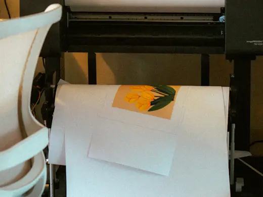
Digital Printing
Business cards to building wraps. We choose the substrate, prepare print-ready artwork, manage the production and deliver the job — you deal with one company rather than three.
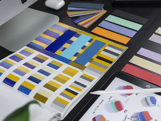
An identity that only works on a screen is half an identity. Most of the places a brand is actually seen are printed, painted, cut or sewn — and each of those has rules a screen does not.
We start with where the mark has to survive: the smallest place it appears, the worst material it will be reproduced on, and the one-colour version somebody will eventually need at short notice. Then we design outward from those constraints. The result is a mark with a minimum size, a clear-space rule, a one-colour fallback and colour specified for both screen and press.
Vector artwork with the letterforms converted to outlines, so the logo opens correctly on any machine whether or not the font is installed — plus the guidance a printer, a signmaker and a web developer each need, written for them rather than for a designer.
Services
Business cards to building wraps. We choose the substrate, prepare print-ready artwork, manage the production and deliver the job — you deal with one company rather than three.

Fast, responsive sites built on the same identity as your printed work, so a customer meets one brand whether they find you on a phone or on a wall.